Search This Blog

Pages

January 30, 2008

Double Stamped Peaches

Here's another card using the same technique as the last post.

Click photo for more detail.


Card measures 4 1/4" x 5 1/2"

For this card I started with pale medium green cardstock. I used Stampin' Up!'s markers to color the peaches (unknown manufacturer). Actually I'm not SURE these are peaches - could be oranges! LOL

I pierced the two corners as shown, and stamped the phrase (Endless Creations) in black ink. I layered this main panel to a black piece of cs, then attached two SU word window-punched pieces of rust cs, folded over the edges, tacked down with rivets. Still don't have any black rivets LOL so I "painted" silver ones with a marker. I layered this to a yellow panel.

*tip*
Slick Writers (like Sharpies) will write on almost any slick surface, without that irred. tint).

I stamped the crackle (Judi-kins) using black ink on an orange panel, then adhered the rest on as shown.

Thanks for looking!

January 28, 2008

Double Stamped Stem

Didn't realize I'd be using a spring word stamp so this card is kind of strange colors for the upcoming season! If I did it again I'd opt for more pastel-y colors.


Click photo for detail

Card measures 4 3/4" x 6 1/2"


I started with a sheet of cream cs, inked up the word stamp (A Lost Art) partially with a purple marker and stamped it. Then using a sea sponge brayer, I loosely rolled gesso over this. After it had dried (less than 5 minutes), I inked the blooming stem stamp (Hero Arts, Real Salvia) and stamped over the gesso. I repeated these steps, the second time just eyeballing it to get an overlapped shadowy effect. Then I stamped the viney image (Hero Arts) in Stampin' Up!'s Close to Cocoa as shown on the panel. I then tore the edges of the panel randomly.

*tip*
Wash your gessoed brayer and surface inbetween coats or it will start drying, making your brayer crunchy and crusty ;o)

I stamped the spring word stamp (Hero Arts) once in brown and once in the wine, then trimmed them apart and edged them with the brown ink. I glued the small words flat and pop-dotted the word Spring. I used a decorative picture hanger and matching brad to attach a sheer ribbon tied with twine as shown. Then I layered the main panel to a wine panel with roughed up edges. I adhered these panels onto a cream piece I'd randomly stamped the vine onto, then adhered these to a brown cardfront.

Thanks for looking!

January 27, 2008

RAK from Mom!

Just got this card in the mail a couple days ago from my Mom and wanted to share (don't worry - I've adopted a policy never to post other's work here without asking permission!). The colors are so subtle that it looks best in person, and I maybe should have used a camera rather than scanner to show all the textures.


(Click photo for detail)

Card measures 4 1/4" x 5 1/2"

This card has a lot of tactile appeal in person! The card front is grey, then there is a layer of torn mulberry paper, then a wallpaper panel with raised stripes. The leaves were Cuttlebugged with the script folder, then run thru it with 2 of the 4 leaf dies. The flowers (from Archiver's Hot Spot) are pop-dotted - there is a gemstone in the center of the small one, and a decorative acrylic dome on the other. What's really hard to see is the sparkle all around the edges of the large flower and the irredescent (I'm sorry! I can NEVER remember the spelling on that word - ugh!) and patterned paper. The sentiment panel is soft metallic gold over cream.

I think it's just beautiful in it's serene colors and clean design, and how can I not feel loved with that sentiment? :o) Thanks Mom!

January 25, 2008

New Blogs Alert!

I'm so excited to be able to tell you guys to head on over to Pawsitively Inky!! Brand new today! Cheri's work is beautiful and inspiring - I've been hoping like crazy that she would start up a blog so the rest of the stamping world can see the wonderful things she produces. I think you will want to bookmark her page for sure :o)


Also, go see Card Art Etc. right now!! Just in case you missed it, Shirley's blog has been up and running for a few days and it is awesome! I'm always so intriqued to see how she uses color and sparkle! And she is generous with the info in case you want to try your hand at something similiar :o)

Faith Tulip with Swirls

Good morning :o)

Lots of times I start with my main image panel, and so as I keep adding layers, my card ends up way bigger than a standard A2 size card - that was the case here! I have both the large and small tulip and for whatever reason I started with the large LOL

Click photo for detail

Card measures 5 1/2" x 7 1/4"

This card features background cs called Technicolor Dye Inks from the Dec TechniqueJunkie newsletter. The basic idea is to use a rainbow pad and brayer, and let me say, anytime you brayer more than one ink color together on the same sheet of cs, you NEVER know what you'll end up with!! I found the colors in my bkgd to be a challenge to match, but fun to try. IRL the purples are a little more true violet.

If you click for more detail you might be able to see that the main panel is actually some white over dark cream cs, and the stamping is done in layers. I was going for a look similiar to a piece of art hanging in the bathroom, but have not come very close yet...will keep trying! Tulip stamp is Hero Arts.

When this had dried, I stamped Faith (Stampin' Up!'s Graceful Words set) in black Versafine and layered it to two torn edge panels as shown. I stamped the verse (SU's God's Way set) on cream cs with the black ink, then overstamped swirls (Autumn Leaves Elegant Flourishes set by Rhonna Farrer) using Colorbox Fluid Chalk Ink in Lavender. This was a second generation stamping as the ink was just a bit too overpowering full strength.

I trimmed my bkgd panel to size, stamped the writing (Penny Black "Letter Background") over one corner in the black ink, and tied a sheer cream ribbon around the panel before adhering it to a purple panel. I stamped some more swirls on the textured cream card front, using the lavender ink full strength this time.

*tip*
Chalk inks can be a lot more liquidy than others, and will usually work well if your cs is textured.

I layered everything as shown, pop-dotting the verse.

Thanks for looking!

January 24, 2008

Happy Birthday to ISC's Estamp-ina!

This image is from a brand new sheet of stamps just put out by Innovative Stamp Creations titled Estamp-ina! The sheet is full of great words like Sweetest Friend, A little something, Take Note, Pssst! Feel Better...and lots of accessory stamp images like boxes to check, a tiny butterfly, spatter grouping, large open circle, etc. plus a bunch more phrases to use for all occasions. This is a great set to introduce stamping to the pre-teen and teen girls in your life.


Click photo for more detail


Card measures 4 1/4" x 5 1/2"

Okay, any of you who know me even a little know how I like to make all my own backgrounds vs. patterned paper, and generally don't get this bright! But I thought both were totally appropriate to show you how quick and easy a younger person could turn this set into something sophisticated but still cute. Or you if you need a hip card quick! ;o)

I used the same challenge layout as yesterday's post, from Mary Jo's blog, laying the patterned cs out as shown (from a 6 x 6 slab book of Embellishment Paper by Making Memories called Tropical Travel - check ISC's site to see if they have any). I wanted to use white for the main image panel so I layered all the printed cs onto white cs before adhering to the khaki card front as shown.

For the main panel, I inked the image with Adirondack Mushroom, then removed the ink from the mouth and eye areas using a rubber tipped Angle Chisel Colour Shaper by Royal Sovereign Ltd. I used markers to add pink to the mouth, and since I didn't have the right green marker to match the bkgd, I used a blue-ish green with yellow over.

I used my needle-nosed glue bottle to apply Diamond Glaze to the entire hair area. Then used the marker to ink the flower stamp, stamped it on a white scrap and trimmed it out closely. I used a glue dot to adhere the flower as shown, placing a flat-back pearl over the center (from Archiver's).

*tip*
My markered flower turned out a little too bright pink so I used a darker toned colored pencil over it to change the tone just enough to blend better.

To get the tabs on the side, I used a Fiskar's hand-held rectangle punch to get the three slots. Then I used a Stampin' Up! word window punch on the flowered cs, folded these in half, threaded them thru the rectangular slots, and put a pink brad thru each. The main panel was adhered to to the word bkgd cs from the same pack, then pop-dotted onto the cardfront. I applied a pop-dot to each tab to hold them in place permanently.

Thanks for looking!

January 23, 2008

Monday Lunchtime Sketch Challenge #1 Beach Chair

There's almost nothing I love in stamping as much as a sketch challenge, as I struggle most with layouts and sometimes I just like to have one handed to me! :o)

This is from a sketch challenge on Mary Jo's blog. There is a list of participating designers just under the sketch so you can go look at some blogs for inspiration before starting, if you want. I had to move my image panel to the other side to accomodate the direction the elements were facing, but otherwise stayed true to the original as best I could.

The one panel is a TechniqueJunkie technique from the current newsletter called Brayered Spots. This is the same technique I used on the time card (in pink) a few posts ago.


(click photo for detail)

Card measures 5 1/2" x 4 1/4"

After I had brayered the spots panel, I realized the three colors had mixed together and caused some pretty hard-to-match tones!! LOL This card is better seen in person as the scan had a hard time picking up some of the more subtle tones. The grass is actually green but it doesn't show here.

All stamps used on this, except the alphabet which is PSX, the Antique set, are Stampin' Up! from the Along the Shore set. Ink colors are Adirondack Mushroom, SU True Thyme (last year's In-Color), Distress Weathered Wood, and Sea Shells Sea Grass.

The upper left corner was stamped with the shells in Mushroom, the text in True Thyme, and then swiped with a white pigment pad and the Sea Grass, to tone it down and better match it to the brayered panel. All bkgd panels were edged from the inkpads.

The main panel was colored in with a blender pen, adding the horizon line by hand, and stippling Sea Grass around the edges to add some yellow tones. I wanted to collage it up a little so I stamped the phrase over it on one side, and added an antiqued rope-border disc with a stamped insert as shown. This main panel was backed with a piece of True Thyme cs, and then a hand-cut frame using some super wide woven ribbon I picked up at Joann's.

*tip*
If you have ribbon edges you worry about fraying, grab some Ranger's Matte Finish glue. It won't dry shiny :o) This tip was first brought to my attention by Debbie on her amazing blog, Thinking Inking.

Then I just pop-dotted the image panel and I was done.

Thanks for looking!


January 22, 2008

Needlenose glue dispenser

I can't get by without my Judi-kins Diamond Glaze for highlighting card elements (see yesterday's post) but sometimes I need a pencil thin line to get the job done well.
When my brother's family was here before Christmas and we were all hanging around the local Rockler's store, my nephew pointed the empty applicator bottles to me (neither one of us being woodworkers, we were searching out oddities and items that could be used genericly.) Well I never realized I needed this till I saw it LOL Now I don't know how I got by without one!


As you can see, the tip is tiny! But I always put the rubber cap back on tightly right after using it and it hasn't clogged yet. I believe it was under $4 with the tax, and the item # is 63297 "Needle Point Glue Bottle" If you're unable to find one to buy and need one, contact me and I can probably buy and ship one to you anywhere in the 50 states for $5 total in a bubble envelope. You can email me anytime at inkblocks@comcast.net
Hope this helps!

January 21, 2008

Folkart Valentine

This is a quick and easy TechniqueJunkies background called Faux Fabric from the Dec 05 issue. It works great for those cards you want to make that only have one main image and you don't have any other images to coordinate.

Stamp is from the Innovative Stamp Creations heart sheet.

Click photo for detail.


Card measures 5 1/2" x 4 1/4"

The colors in this card utilize some of last years In-Colors from Stampin' Up! and are actually more muted irl.

To make the main image I lightly brayered Cranberry Crisp over white cs, then stamped the heart in black Staz-On. I used colored pencils to fill in the elements and highlighted the rope borders with a Sakura gelly roll pen. I covered the letters in Diamond Glaze using my needlenose applicator (buy one of these from Rockler - they are under $4 and never clog!!)

I tore a couple hearts out of Cranberry Crisp and Vintage Violet and layered these to the main image panel. I wanted to staple the ribbon on, but only had large ones so I cut two small slits as shown to thread the ribbon thru. I stamped the heart again on a scrap, trimmed out the flower, and pop-dotted it over the top of the ribbon "hanger".

Thanks for looking!

January 19, 2008

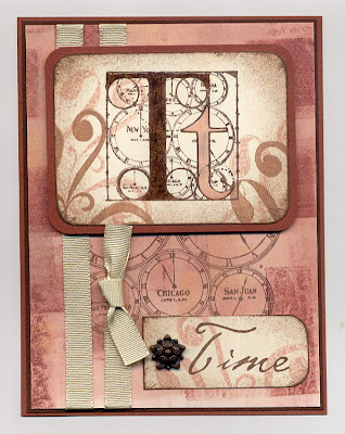
Time in Pink

This card is serving a number of purposes! It's the sketch design Dini has up on her blog this week (thanks for letting me play along too!) and also fits the Time-themed lottery card for this month on StampersCorner. PLUS, this card features a background from the current TechniqueJunkies newsletter called Brayered Spots. Very fun technique with surprise results every time!


Card measures 4 1/4" x 5 1/2"

There is no gray in the pink of the small t irl - I think that's a reflection from the scanner on the 3D glue (see below). All stamps except the flourishes are by Second Star on the Right (Time Travel sheet) which I think is out of business (sadly ;o( The flourishes are by Autumn Leaves, Rhonna Farrer Big Swirls set.

Ink colors used are Distress Tattered Rose, Palette Burnt Umber, and VersaMagic Sahara Sand.

The center panel was edged from the pad with Burnt Umber and then stippled in with a brush. The small t was colored in with the Rose ink and then both the Ts were covered with Diamond Glaze dimensional glue. I use a superfine needlepoint bottle from Rockler to apply in tight spaces.

The main panel is pop-dotted and the embellishment in front of "Time" is a decorative metal brad with an antique copper finish.

Thanks for looking!

January 18, 2008

More Travel Souvenirs

All the stamps used on this card are from the same sheet used in yesterdays post, by
I Brake for Stamps on the Time to Stamp site (Travel ATC sheet).
I made the card and then saw this corner laying around and added it later, so you can see both versions below.

(Click for more detail)


Card measures 5 1/2" x 4 1/4"

This card layout was inspired by a Sketch Challenge (#92) from an awesome online group I'm in - StampersCorner. The sketch called for one layered oval but I needed to make two, which is okay! LOL I always assume sketches are a great jumping-off point to help the imagination create something wonderful. The color scheme I was inspired to do by the awesome Knight art on Gerrie's blog currently.

I started my card by grabbing a background I had made earlier using one of the TechniqueJunkie techniques from the current newsletter - it's called Technicolor Dye Inks, and provides a soft washed-out feel which always looks so good with vintage images. I just used a regular circle punch to punch the corners for interest.

It's hard to see but there is some yellow in the center of the background and since I didn't want to use all pink tones, I stamped the portraits on pale yellow cs using a VersaMagic Malted Mauve dew drop inkpad. (These portraits are actually one stamp, with them side by side and surrounded by a borderline.) I stippled the same ink around the edges but it looked too blah, so I stippled Palette Burnt Umber in the same way and edged the ovals straight from the pad. I mounted these to ovals of textured dark wine cs.

The ovals are McGill Creativity punches and were my big splurge last fall as I paid full retail. That was before Nestabilities had entered my landscape - now they're on the wishlist. LOL Sizes are Stacking Oval 1 5/8" x 2 1/8" #95931 and Stacking Oval 1 15/16" x 2 7/16" #95930.

I ran the lighter strip thru the Cuttlebug with the Script folder and highlighted the letters with the chalk inkpad. The corner doodad is also a CB product, from the set of four dies called vintage (all of which my Dad generously bought for my Christmas present :o)

*tip*
Save all those decorative Kleenex boxes, etc. for these - they are semi-glossy and sturdy enough not to tear when you have to pull them off your Xyron sheet! Below are a beautifully marbled set to show how cool they look.


I stamped various images on the bkgd in Burnt Umber and then adhered everything as shown.

Thanks for looking!

January 17, 2008

Sketch {008} Eiffel Tower

Here's a card for Gerrie ;o)

I got this sketch challenge from Erin's blog and had so much fun not having to think about a layout! These awesome stamps are all I Brake for Stamps from the Time to Stamp site(Travel ATC sheet).


Card measures 5 1/2" x 4 1/4"

I stamped the Eiffel Tower in Versafine black ink on Stampin' Up!'s Whisper White. I stippled some black ink around the edges and then edged the panel straight from the pad for a distressed look. Using SU's True Thyme and Sahara Sand, I stamped the globe, words and receipt as shown.

I used a wide-set ribbon punch to punch just one slot along the edge and tied a couple ribbons on as shown. I adhered this to an olive panel and then a black panel.

For the background panel I stamped the map twice on a Sahara Sand panel, using True Thyme.

*tip*
If you stamp something twice and get a dark line where they meet, if the colors are neutral you can sometimes use a white rubber eraser to remove a little color without smearing the pattern.

I distressed the edges with the Tim Holtz distressing wheel and drew black lines using a Zig marker. The dots are matte-finish black brads. This panel was adhered to a black panel, and then to a white cardfront. The main panel was pop-dotted over this - irl this can really help a card not to look too "flat".
Thanks for looking!

Thanks for looking!

January 16, 2008

Scallop Punch Info

Hi Donna :o) and anyone else wondering about how to get that scalloped square punch used on the last card. Can't remember where I purchased it, but the brand is McGill Creativity and the info is Stacking Square - 1 7/8" Scallop P/N 95908. There is a website that sells just about every punch under the sun and if I come across it soon I'll post it. Thanks!

January 15, 2008

An un-hearty Valentine

I felt like working with black on a red background, and I wanted to try out one of the techiniques in the current TJ newsletter, Burnished Embossing. The scanner didn't appreciate this color combo and left all sorts of echoes in the red area, so same old refrain >;o) looks better in real life.


Card measures 5 1/2" x 4 1/4"


All stamps are from the Rustic Artsy Swirls half sheet of rubber by Innovative Stamp Creations Be sure and click on the ISC blog link on that page for fabulous new art!!


I started by embossing the swirls and medallions in black, rubbing red ink over the embossing and then highlighting the medallions with a white gel pen, which of course turned pink. LOL


I stamped the butterfly on white cs, using black Versafine ink, and coloring it with pencils. I got the idea for off-setting it in the panel on Kimm's fabulous blog, Kimm's Daily Grace. Go check it out - she's got a fabulous ribbon treatment you will love!


Because I had embossed the swirls I used glossy black paper to punch the scallop-edge panel and the layer behind the red.


I stamped the sentiment with medallion using the black Versafine. The slim white panel has the large medallion stamped repeatedly with Stampin' Up!'s Real Red.
It's hard to see but the black is adhered to a white cardfront.
Thanks for looking!

January 13, 2008

My top five...cookbooks!

Thought I'd start a new topic - My Top 5 - for Sundays since I don't usually get a card posted. (Sundays are also the day the sidebar items change for those reading them :o)

I was just cooking a pot of Ham, Potato and Leek soup and remembering the awesome cookbook it came from. So here they are ... my Top 5 cookbooks at the moment:

NOTE: I am not a gourmet cook (although I very much appreciate fresh, well prepared food) and have little time and patience for kitchen duties, so you KNOW these are great, user-friendly books! (You'd think I owned stock LOL which I don't ;o)

1. HOW TO COOK WITHOUT A BOOK by Pam Anderson

~ she takes basic premises (soup, sauteing, etc.) and shows you an easy, delicious base recipe and ways to add to this for an endless list of different recipes to suit any taste. Great for those of us unable to throw items into a pan with apparent abandon and have them come out tasting like anything at all. The basic soup recipe has served me very well.

2. THE PERFECT RECIPE by Pam Anderson (okay, I feel stupid! I did not realize till just this minute that these were by the same person - no wonder they are my top two!!)

~in this book LOL she lays the book out into chapters of American favorites (Everyday Classics, Special Dinners, Be All and End All Desserts, etc.) and tells you all the different ways the test kitchen tried cooking them. It's awesome to read thru the process (her writing style is not the least bit dry or heavy). The One-Pot Chicken Pot Pie alone is worth buying the book for. (Which by the way, is a dish I've never liked till this recipe - I made it to humor my husband and then fell in love with it. It's absolutely nothing like any I've ever had.)

3. SAVING DINNER by Leanne Ely (who I found thru the Flylady site)

~this book is awesome! It's laid out in seasons, then weeks. At the beginning of the week is a shopping list, and then the recipes. Each recipe has the nutritional values and suggested sides (realistic ones - this book is all about foods your family will eat!)

4. COOKING THIN WITH CHEF KATHLEEN by Kathleen Daelemans

~ real, fresh food, easily turned into what feels like gourmet. Lots of sidebars listing shortcuts and valuable tips. Buy this book for the Pork Tenderloin with White Wine Sauce - it's so delicious!

5. SIMPLY THE BEST by WeightWatchers

~ laid out like a typical cookbook, this is full of made from scratch, full flavor dishes. Lot's of comfort foods you grew up with and love to eat. I really like that there is a little blurb about the contributor and all the nutritional info. Can't wait to try the Hot Asiago Spread!

I hope this helps revive someone's kitchen time - real food cannot be beat, and I need to make an effort to eat more of it myself :o)

January 12, 2008

A huge thank you!!!!!!!!!!!!

Wow! You guys are the best. All the comments here and in my inbox have been so appreciated. Makes me feel all warm and fuzzy inside :o) Thank you!

On another note, a quick update on my "new year's resolutions" progress. My house is not quite as picked up or as clean as I'd like, but I have been doing the treadmill 1/2 an hour a day 5 days a week, and a personal Bible study first thing each morning. So I'm happy - anything changed, even small, is progress in my book! LOL

Have a great weekend!!

January 11, 2008

Arctic Seals

Just a quick hi and a winter-inspired card. I have a pile of work to do today! LOL

Card is jumbo! 6 /1/2" x 7 1/4"
The colors in the scan are a bit off, but you get the idea. Some things you can only see irl: there is a "pool" of water in front of the seals (Stamp Affair) made by using Judi-Kins Diamond Glaze, which dries 3D and clear (mine is a bit yellowed here :o( Also, I stamped the seals on textured paper, made by rubbing cs over a table edge repeatedly to break up fibers, and then picking at the corner to peel into two layers. This provides a fuzzy, suede type finish. (thanks Beate's blog Fresh & Fun under the Leather post for this cool technique!)

I started by doing two Watercolor Distress backgrounds, one in Weathered Wood, and one in WW and Walnut Stain. On the blue-only one I stamped the mountain range (Cowtown) in Staz-On Stone Grey and highlighted it with a Sakura Gelly Roll sparkle pen. It looked too stark so I ran a white pencil over the lines.

I stamped the seals in Staz-On Timber Brown and trimmed them out. I colored them in lightly with pencils for definition, and then pop-dotted them onto the bkgd (I had stamped just the head of the large one on first, so I wouldn't have to trim whiskers out.) It looked too plain so I stamped the sun (Stampin' Up Scenery Set), the birds and water (Just For Fun) in the WW.

I applied khaki photo corners to the main panel, and then adhered the layers as shown. The darkest layer is brown and not black like it appears.

Thanks for looking!

January 10, 2008

Exciting News!

I just want to let you all know that I get to be a guest artist on the April issue of TechniqueJunkies!

I know it's not too late if you want to sign up for this year's worth, and I promise you won't be disappointed! There really isn't a better subscription to anything out there for under $20 a year!!

The issues are published every other month which gives you just enough time to try all 10+ techniques per issue. In addition to the full-color six page newsletter with complete instructions for all techniques, you receive a password for access to the online site which contains pages of all techniques with step-by-step photos, plus inspiring artist sample artwork. And as if THAT'S not enough, you get to join the email group and receive fabulous artwork and great stamping tips that other members share daily!!!

If you go to the site, you will see a sample of the Milkpaint technique - this is how the step-by-step photos with instructions appear on each online technique page.

So come join me, and about 2000 other subscribers - you won't believe how much fun you can have and how many of those various items you bought willy-nilly over the years will now be put to good use ;o)

January 09, 2008

Zebra Baby

Last night was monthly Stamp Club and our theme was Wild Animals. We all make a sample card and then take along all the componants so everyone gets to make everyone else's card. It's a nice cozy little group so it's never too overwhelming.

(Click photo for more detail)
Card measures 4 1/4" x 5 1/2"
This is one of those cards that looks better in hand. The leaves are clear embossed and the white panel has score lines around it. I have to give credit to Debbie at Thinking Inking for the layout idea, and also she brought to my attention that I could use a Scor-Pal to make the embossed box around the main panel. Go check out her blog - she does amazing work!
I used VersaMark ink to stamp the leaf bkgd (Stampin' Up!) and then embossed it with fine clear detail powder. Versamark can fade over time so the embossing over it keeps it's integrity long-term.

*tip*
Nancy S. reminded me last night that if you coat a clipboard with tinfoil you can just clip your artwork to the board to emboss. The tinfoil allows for more even heating and your cs is less likely to warp. Also, wait for your heat gun to get good and hot before aiming it at the cs, and heat one area at a time, moving the nozzle along as each spot melts.

I stamped the zebra (Stamp Affair) with black Versafine, then highlighted the edges of his coat with a Tombow biege-tone marker #020. I added some shadows under his hooves with a grey-tone marker #N89. I cut this image into a rectangle and used the Scor-Pal to emboss a border all around. I then used a circle punch to make a notch as shown. I layered this to a biege panel with the same type of notch.

I pop-dotted this panel over the leaf panel and then threaded a gingham ribbon thru, tying a knot near the notch. I added a small jewelry tag edged with the beige marker and stamped with a Stampin' Up! word (Good Times set) by tying it onto the ribbon with a length of fine twine.

Then I just adhered the leaf panel to a black panel and then adhered that to a dark orange panel.
Thanks for looking!

January 04, 2008

Word Tags

I'm liking the pocket-card theme, so here's one that I did for Innovative Stamp Creations earlier this year.


Card measures 4 1/4" x 5 1/2"

I had a sheet of rubber from ISC that was all words (Scrapbook Layout sheet, I think), and I wanted to see what I could come up with using just these with no images.

I started with a scrap of bkgd cs I had made using the Watercolor Distress technique (see yesterday's post for quick description). I believe the Distress ink colors I used were Frayed Burlap and Worn Lipstick. I edged the panel with a sponge and the Burlap ink.

The tags are tucked into a premade library style pocket, but these are easily made with a little cutting, folding and corner-rounding. I edged this with a little ink, stamped it as shown, and added a wide Stampin' Up! ribbon. I tied a piece of white twine around this and added a tag by cutting a slit in the reinforcement part.

For the tags, I think I used regular size tags from an office supply store, and cut them down to get them narrower and retrimmed the corners.

*tip*
To get even corners no matter what the angle, trim one corner off, take the discarded piece, lay it on the other corner matching the edges up, draw a pencil line and cut.

I stamped each side of the tags with a word (soulmate, simplicity, etc.), and a postmark or cancellation mark (both also on the words sheet), then edged each tag with ink. I chose some coordinating ribbons and tied them on in various ways for interest. I believe I used Distress Peeled Paint in addition to the other colors mentioned.

*tip*
To get nice v-shaped points on your ribbon ends, just fold ribbon in half and use a nice sharp scissor (like for quilting - Fiskars and Tonic are my choices) and cut on the diagonal.

I adhered everything as shown and that's it - a fun, interactive card for the recipient to play with ;o).

Thanks for looking!

January 03, 2008

Dry Embossed Flowers

Today's card is in honor of the birthday of the fabulous owner of I Brake for Stamps! And also a chance to really try out the Cuttlebug machine my Dad gave me for Christmas (thanks Dad! ;o) It's an awesome tool for card-making and I'm just getting started with the experimenting! On a whim I ran some fancy semi-glossy marbled Kleenex box cardboard thru earlier and cut some really cool decorative corners which I hope to turn into a card...

Card measures 4 1/4" x 5 1/2"
I meant to make a card using a neat technique in the newest TechniqueJunkies newsletter but I neglected to reread the instructions first so this is a conglomeration!

I had had this background in my UFO (Un Finished Objects) drawer for quite awhile. It was a Watercolor Distress technique that went wrong for what I was wanting it for at the time so it got shelved. I'm so glad I saved it because I really like it for this. The center of the metal frame was the outside edge of the bkgd.

Here's the basic steps of what I did:

For the background cardstock, I believe I used Distress inks in Spiced Marmalade and Peeled Paint. To lay the color down I pressed the orange ink pad to a nonstick craft sheet, spritzed with water, then laid cream cardstock in it. I let this dry awhile, then did the same with the green. It looks like I was pretty liberal with the color application LOL

I ran this piece thru the Cuttlebug with the Stylized Flowers folder and then edged the panel with some Stampin' Up!'s True Thyme. I used a Colorbox Stylus handle and firm sponge-tip to apply white acrylic paint to the embossing.

I stamped Happy Birthday (Hero Arts) on the scrap in green ink, and attached it under the metal label frame. Then I just wrapped some True Thyme ribbon around the panel and adhered it all down with 3M ATG tape, tying an extra piece on for interest, and adhered the metal tag over this. I layered the embossed panel to a green panel to a rust panel.

Thanks for looking!

January 01, 2008

Happy New Year!

How's the resolutions list coming along? LOL I actually made a workable one this year which is odd for me - I usually don't even bother making one! But recently I've just felt like I needed to regroup a little bit. Best of luck with yours this year!

Here's a specialty fold card going out to my brother and his wife and family tomorrow to thank them for hosting Christmas this year. They did such an awesome job - their home is beautiful and comfy, they have lots of bathrooms for the morning rush LOL and the food was outstanding as always. It was a pleasure to be there, even counting the long drive to and from in less then ideal weather and road conditions. The older I get the more I appreciate all getting together and catching up. My brother's so talented in wood-working - he put such a fabulous 6-light votive stand he made in my "stocking" that I would have been happy to have just that! I'll try to remember to ask him if it's okay to post a photo of it here for you....

I got the layout idea for this card browsing what I think was a Papercrafts magazine at Joann's a few days ago. You may need to click on the photos below for more detail:


For this card I just cut a piece of dark kraft cs in half the long way, then rounded the corners with a Stampin' Up corner punch. I used the Scor-Pal (see yesterday's post) to score in half, then at the 1 1/2" line on one end.

I then cut a white panel to fit under this flap, and stamped it with flourishes by Stampin' Up! (Finest Flourishes set) in Versafine black and SU Cranberry Crisp from last year's In Colors. I adhered the white panel to the kraft card front, and then added punched and layered circles as shown with eyelets before adhering the kraft flap down to the cardfront. I tucked a little embroidery floss under one eyelet and wound it around as shown, tucking the end under a circle.

*tip*
If you don't have the color eyelets or brads you need for your project (I couldn't believe I didn't have any black!) just use a permanant ink to color them. Here I had silver eyelets and used a Slick Writer in black. You could also try alcohol inks, Sharpies, embossing ink and powder or nail polish.

I cut a red rectangle from textured cs and rounded the corners, then did the same with a white piece. I stamped thank you (SU Sincere Salutations set) in the black ink, and the swirl in the Cranberry. I adhered these as shown over the flap.

For the pull out tag panel, I cut a white panel narrow enough to clear the double-stick tape holding the kraft card together along the sides. I stamped a swirl on the bottom in black in, then punched a few coordinating circles for the tab. The red is a half circle glued down, and there are two kraft cs circles back to back with a looped ribbon and the brad prongs tucked between.

*tip*
When mailing a card like this where there are some embellishments that stick up a bit, either put a scrap piece of cs the same size as your card over them in the envelope, or apply clear packing tape to the outside of the envelope where they rest to avoid tearing while going thru the mail system.

Thanks for looking!